Welcome! My name is Shalom and I am a passionate graphic designer and photographer. With five years of experience in various marketing and communication roles and 8 years of photography, I have developed a passion for creating and enhancing brand identity, engaging with target audiences, and delivering exceptional customer service.
I’m excited when I can combine my skills in graphic design, photography, and social media management to produce visually appealing and effective marketing materials. Additionally, I continue to expand my knowledge of current design trends and best practices to optimize engagement and reach. My goal is to contribute to the ongoing evolution and success of new companies as well as to refine and showcase my creative and professional abilities.
Here you will find a selection of work from various companies for and projects I’ve worked on. They shocase areas of marketing design, brand development, social media content, and photography.
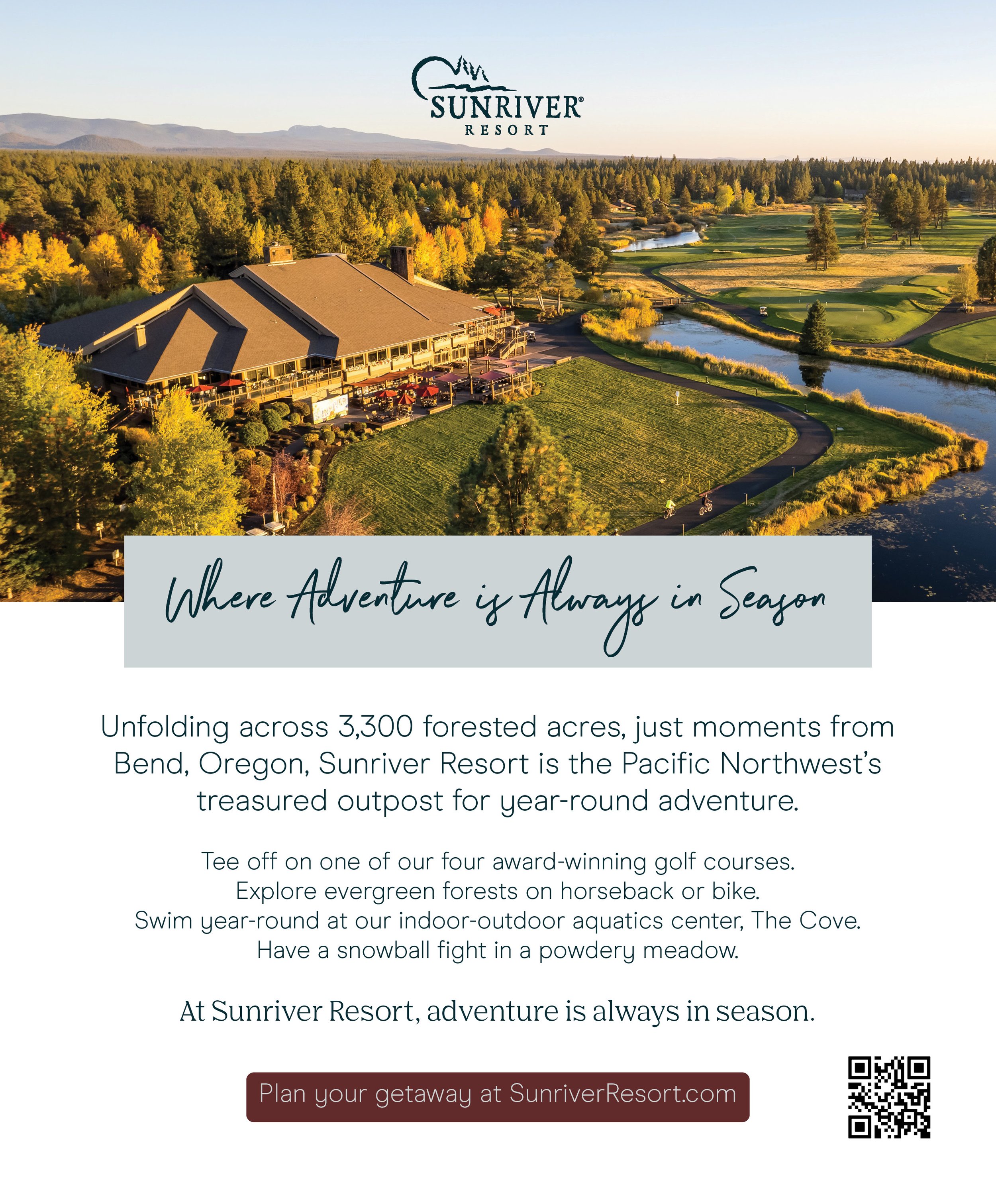
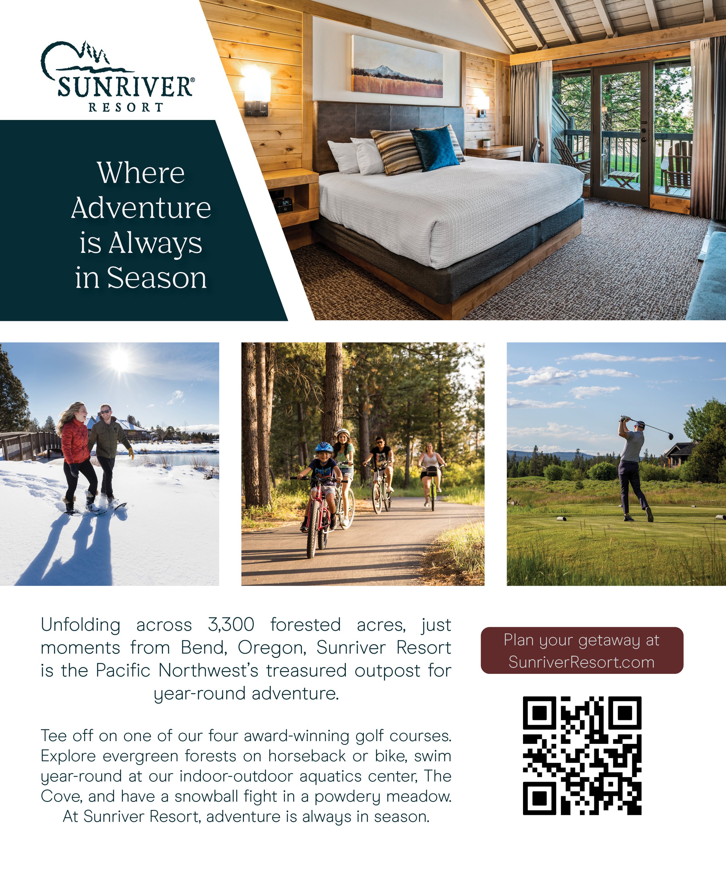
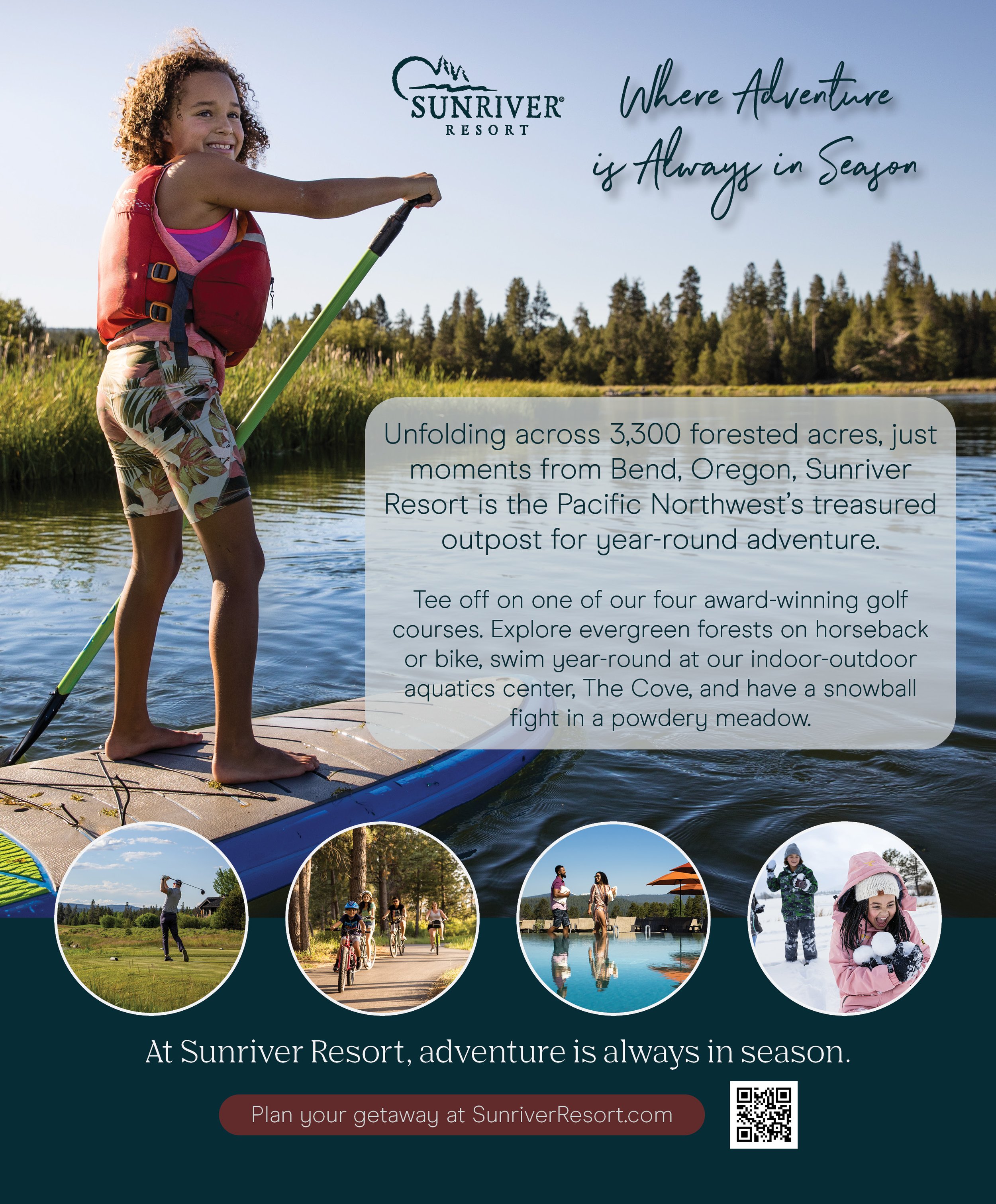
Sunriver Resort
The images below are Magazine Ads for Sunriver Resort. I tried to capture the spirit of adventure, while giving a variety of styles to use for various purposes and audiences. After being supplied the copy and assets, I was asked to create a full page ad for a magazine insert. Using their color schemes and font styles, I designed print-ready ads within their parameters of live space, full bleed, and trim guidelines.


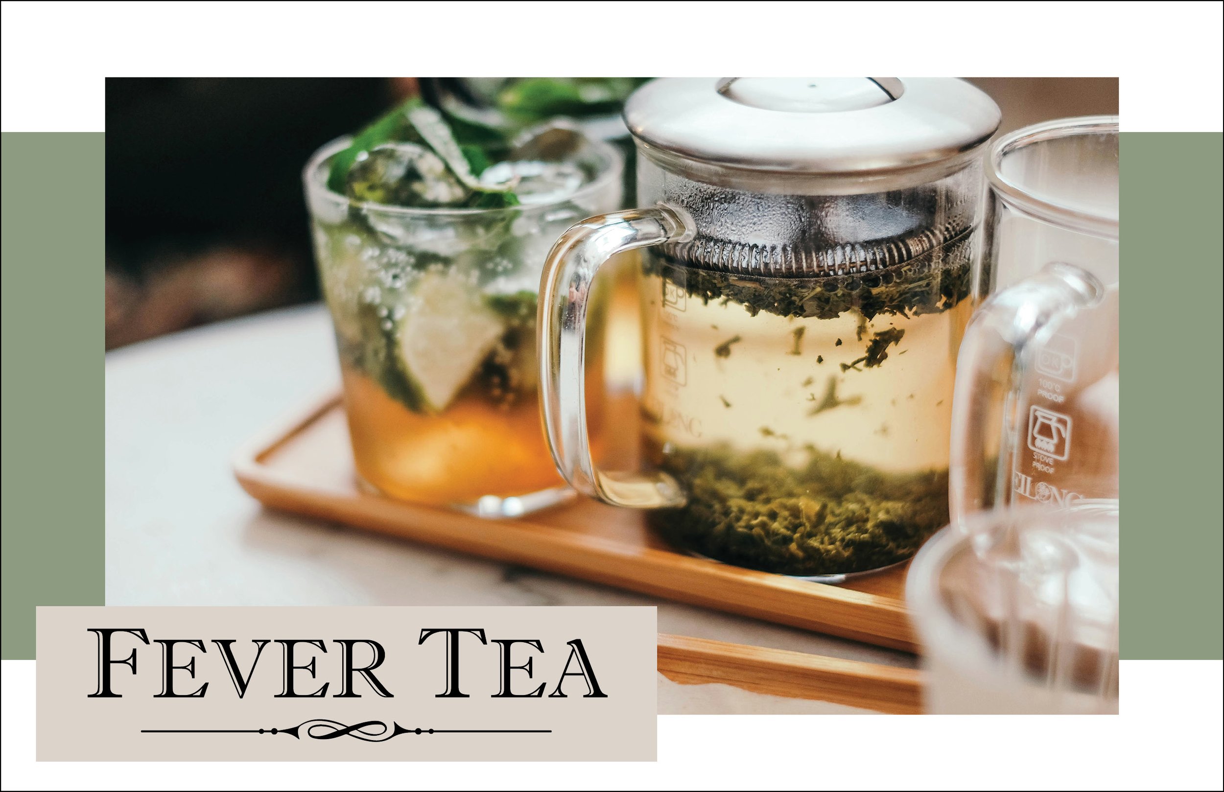
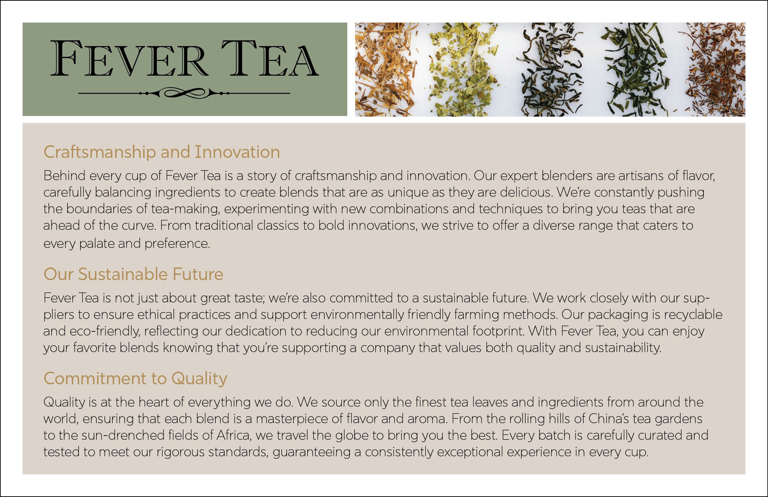
Fever Tea
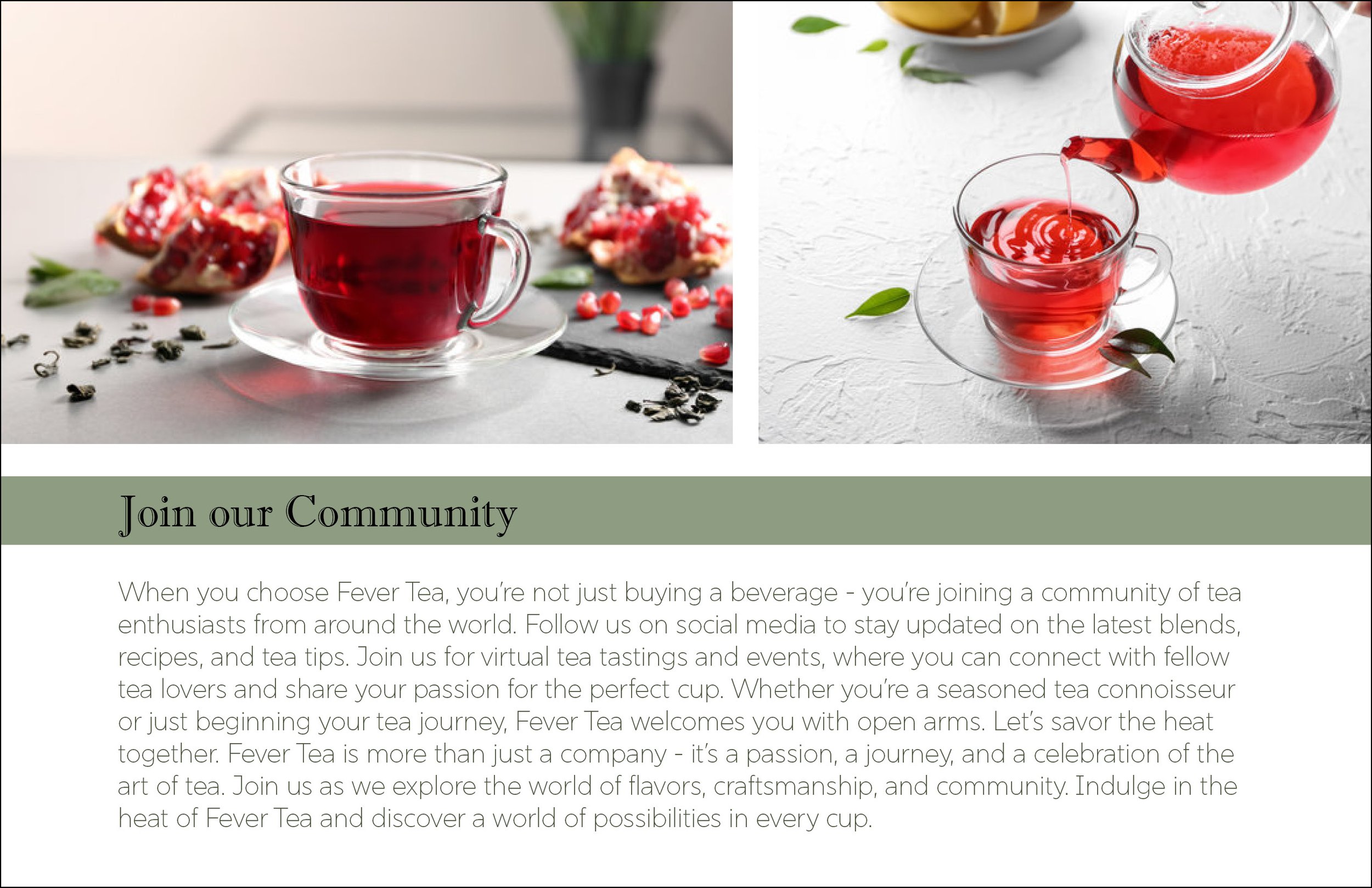
Fever Tea is a company and brand project that displays how text, color, and design can work together to create an impactful brand guide.
For the Logo, I chose a Serif font style that represents the timelessness of tea and the history of medicinal properties it carries. The serif font paired with the san serif body font, bring the historic and modern themes together, representing the history of tea bringing us into the modern age, still being embraced and celebrated.
The Colors were chosen to represent an earthy vibe, focusing on the green representing peace and tranquility. I paired with the soft grays for balance and calm, something you hope to achieve while drinking tea.

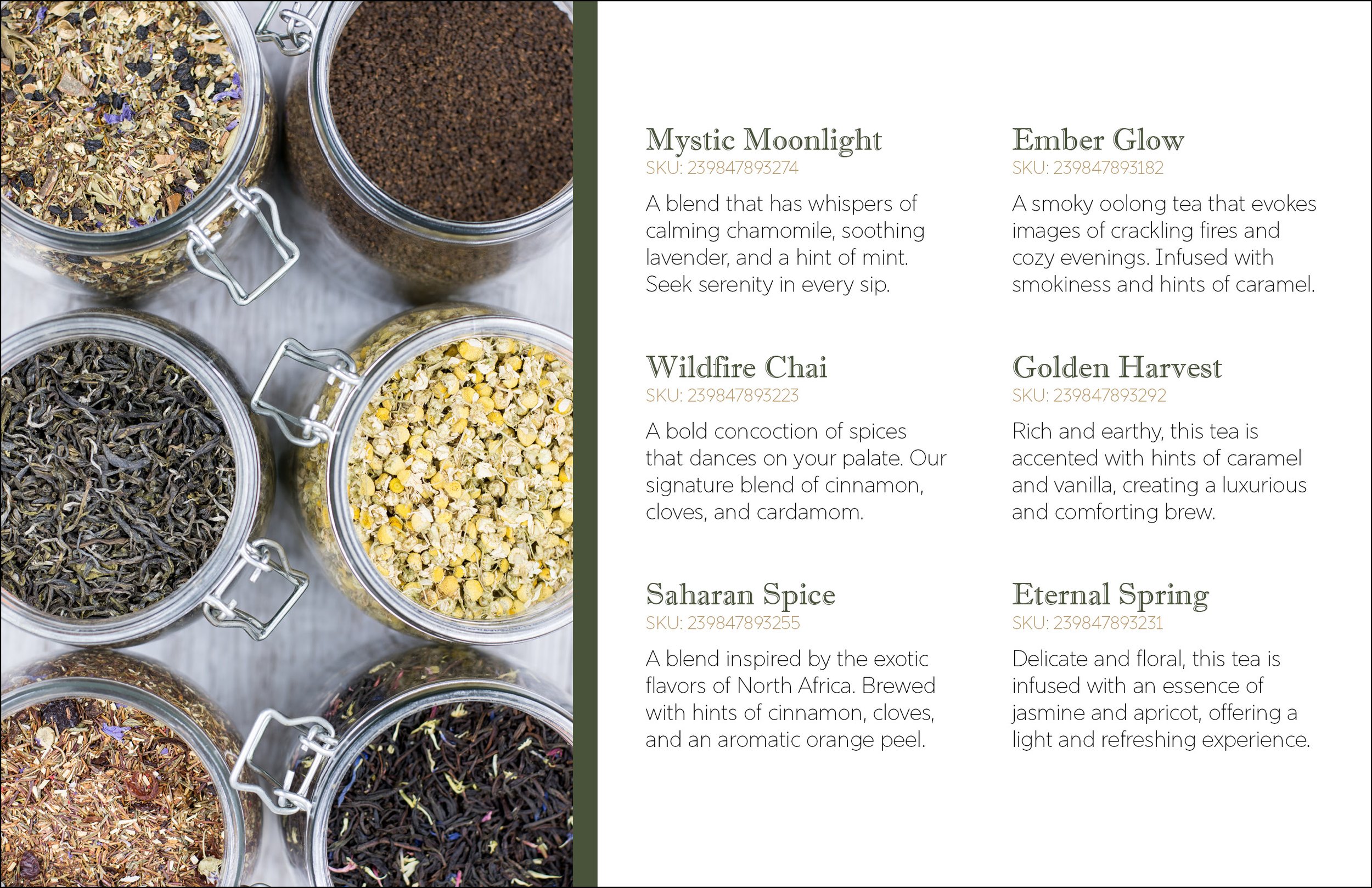
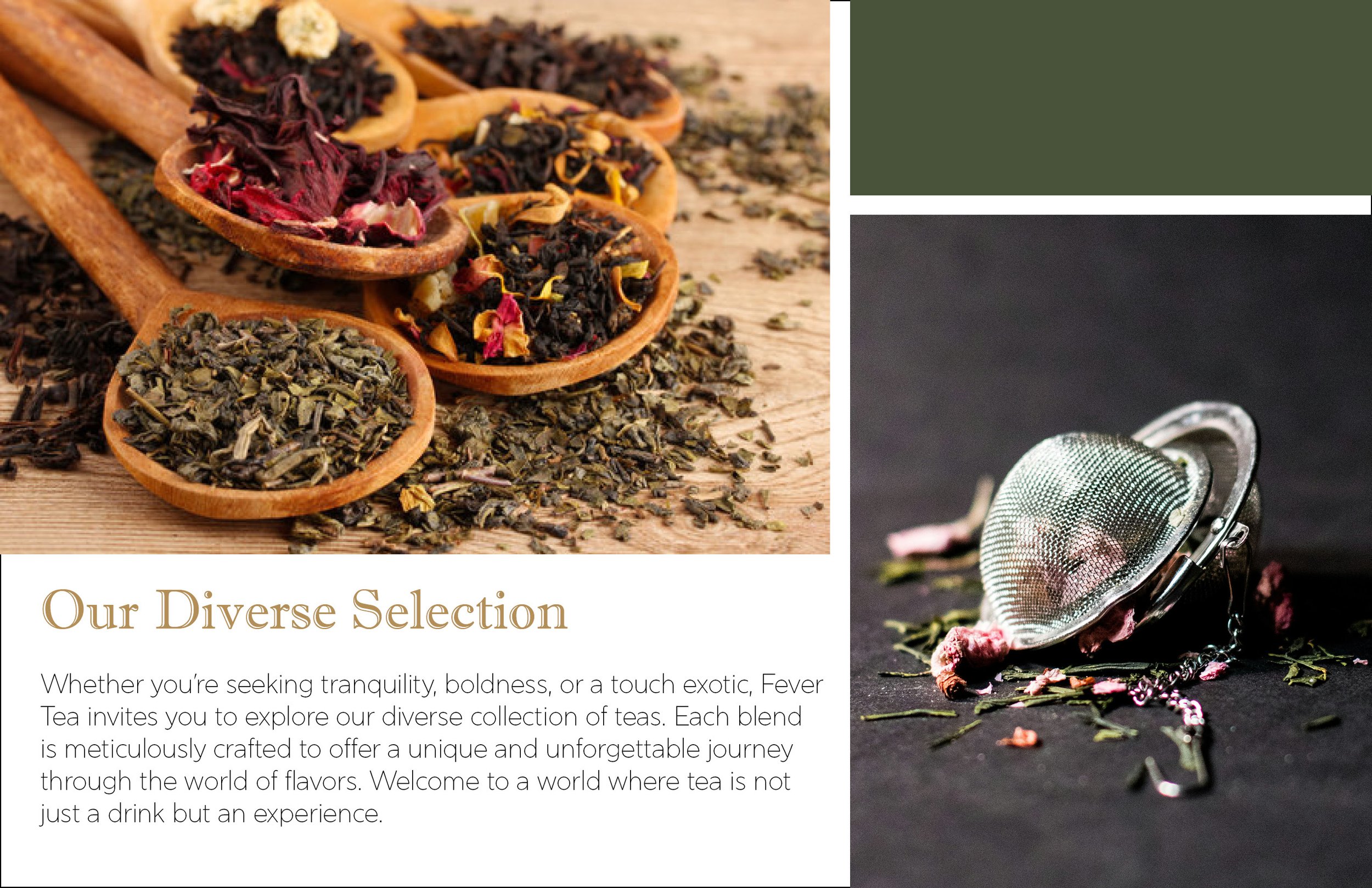
Below is a collection of 6 pages of a small catalog booklet/brochure. This modern style design allows for a clean and easy viewing experience for the consumer. The captivating design keeps the audience engaged, exploring the products while understanding and recognizing the brand and company identity.

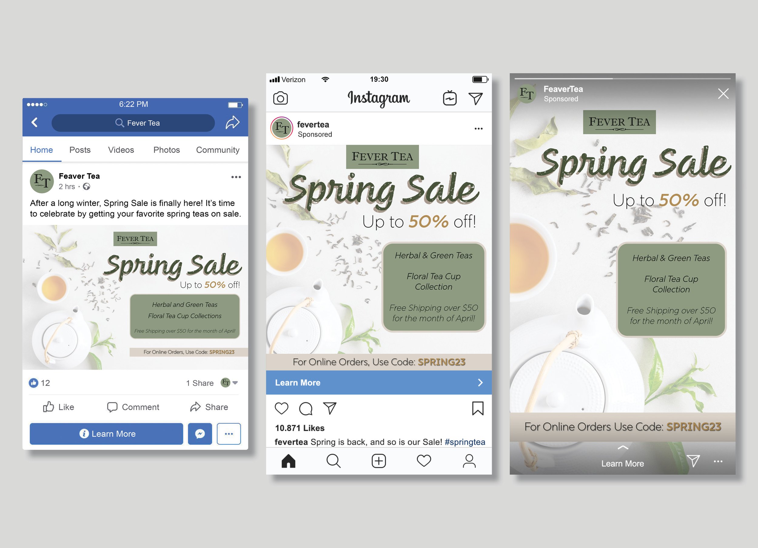
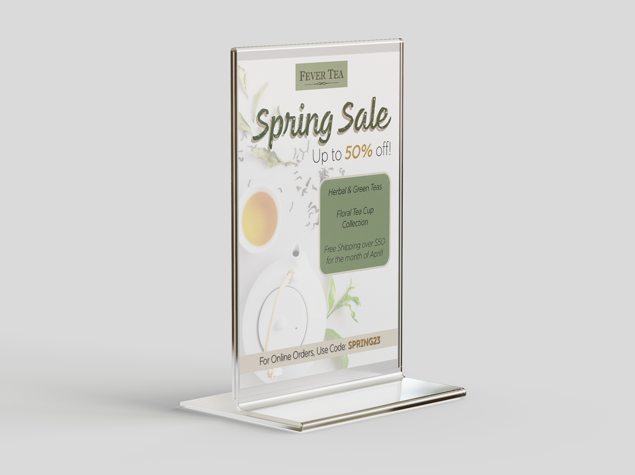
Last is an example of a marketing campaign for a seasonal sale. This design brings a floral spring feel to the established brand guidelines. After the main design style is approved, it has been resized and fit to a wide range of social media publishing, including Facebook, Instagram posts and stories, and an in store flyer. This allows for a wide range of audience viewing while keeping the integrity of the initial design intact.
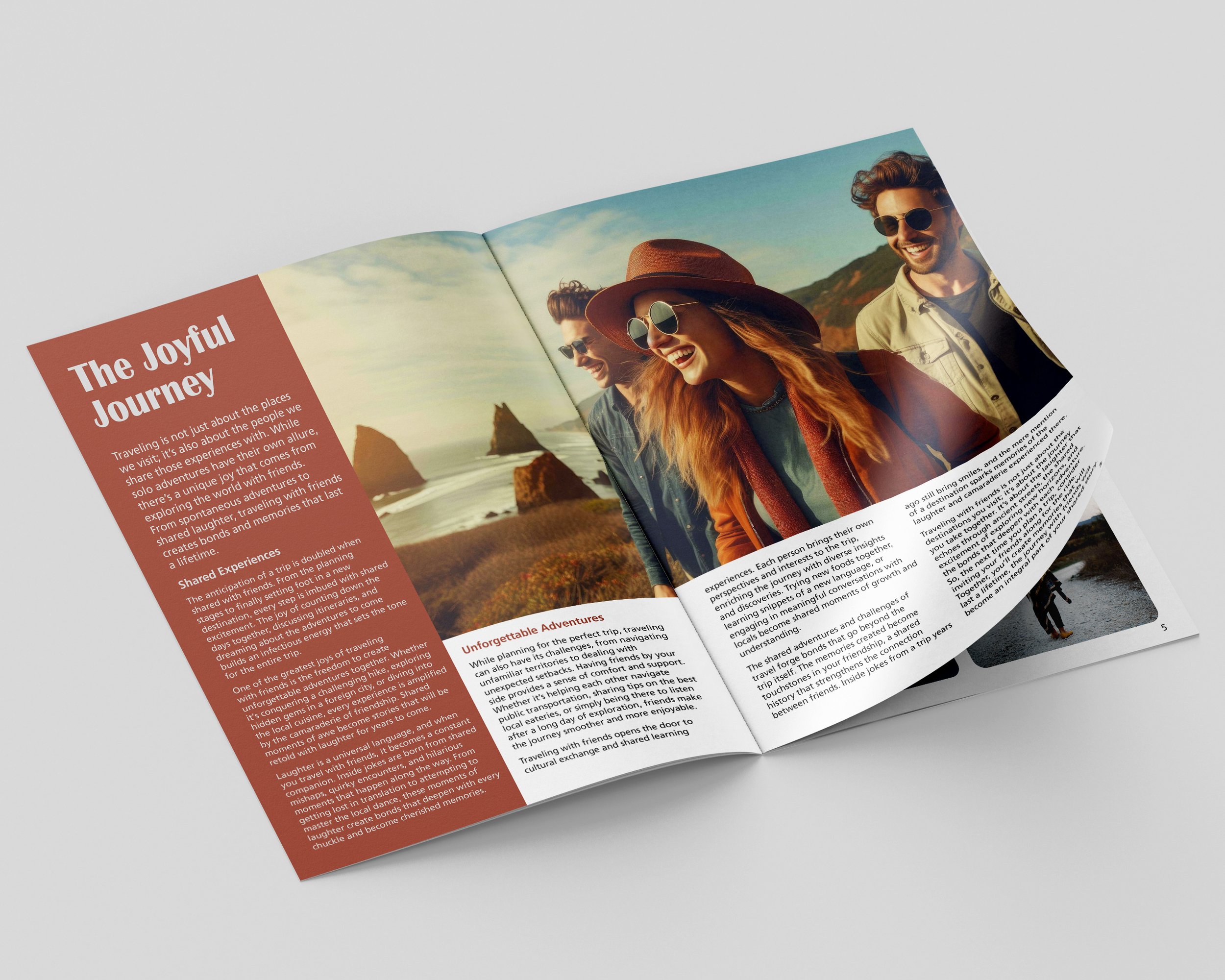
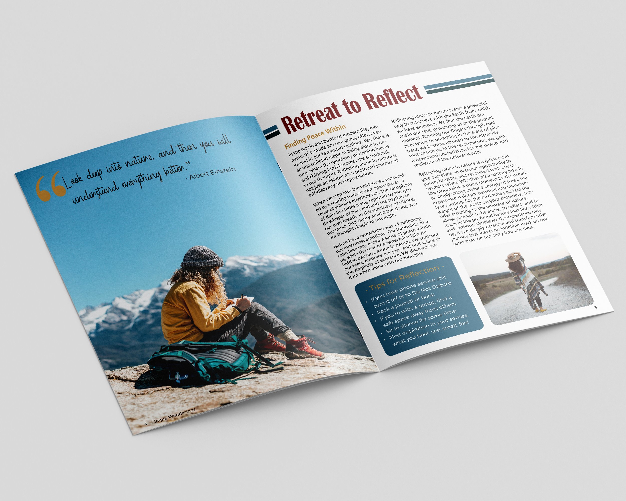
Magazine Layouts
Below are pages displaying pages and print layouts for a travel magazine. They use color theory and layout design to bring playfulness to the pieces, without losing the integrity of the ease of reading. This allows for a fun viewing experience that keeps the audience flipping pages or picking up the magazine from the shelf.

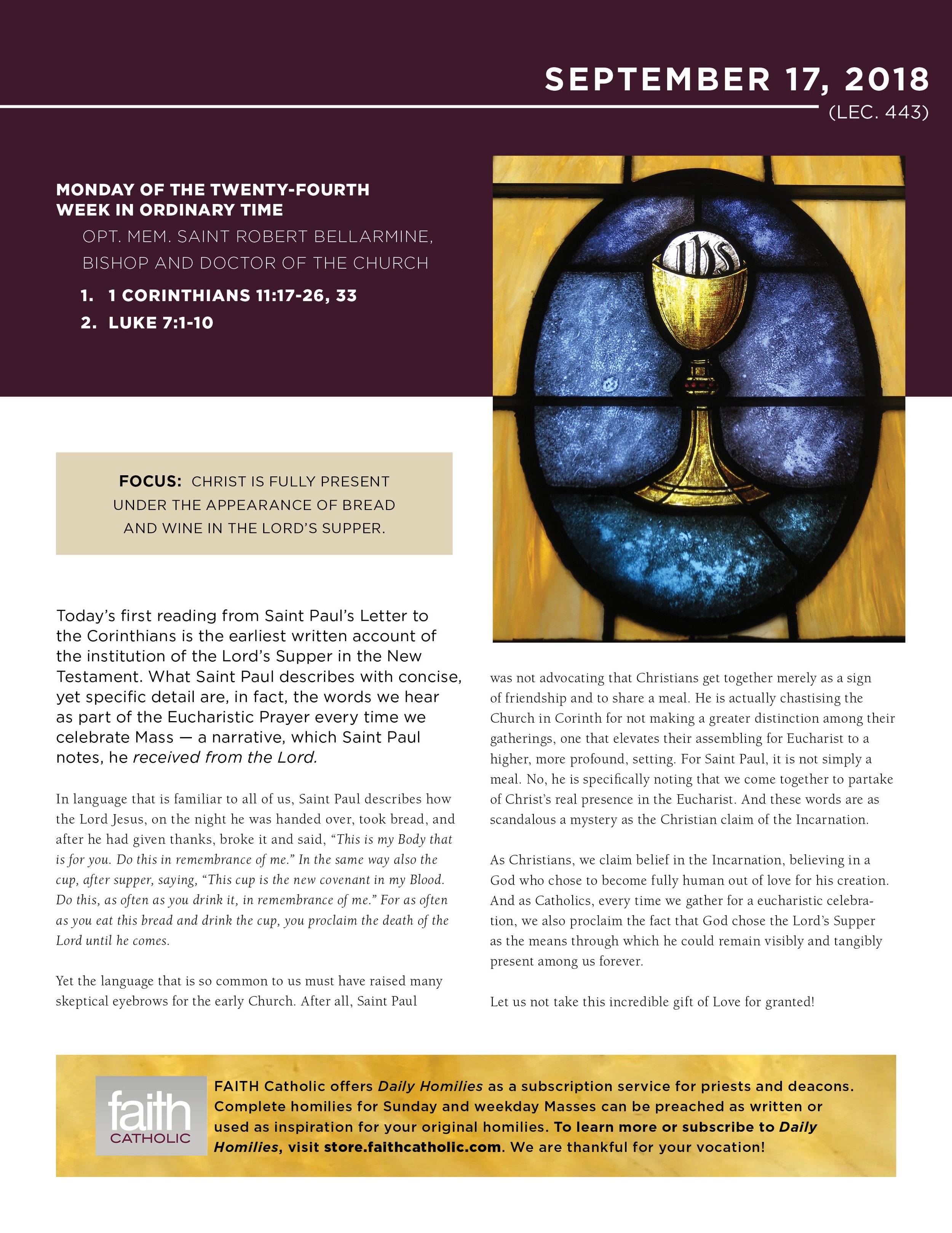
FAITH Catholic Publishing & Communications
FAITH Catholic Publishing & Communications is the Largest Publisher of Catholic Magazines, with over 50 magazines for Diocese across the United States. I had the opportunity to work as a Graphic Design Intern at FAITH where I created and updated brochures, flyers, posters, and liturgical products. These documents were made ready for print, web, and social media use.
Weekly Email Focus
The purpose of these email document attachments was to educate and inspire. After reading the articles, I was tasked with finding appropriate pictures to source to represent the piece. I also adapted the other element pieces to tie the documents together, utilizing the similar layout format that welcomed audiences with familiarity while still achieving fresh content that kept them engaged to return each week.


Vacation Grocery Delivery
For Vacation Grocery Delivery, they wanted their brand to have a fun and playful feel, similar to the beloved stories of Disney. Their vision was similar to cotton candy in colors and softness. Below you can see the designs I created to match that concept, while also involving their audience to create higher viewing and engagement. Through doing so, I was able to increase their followers by 1,000+.

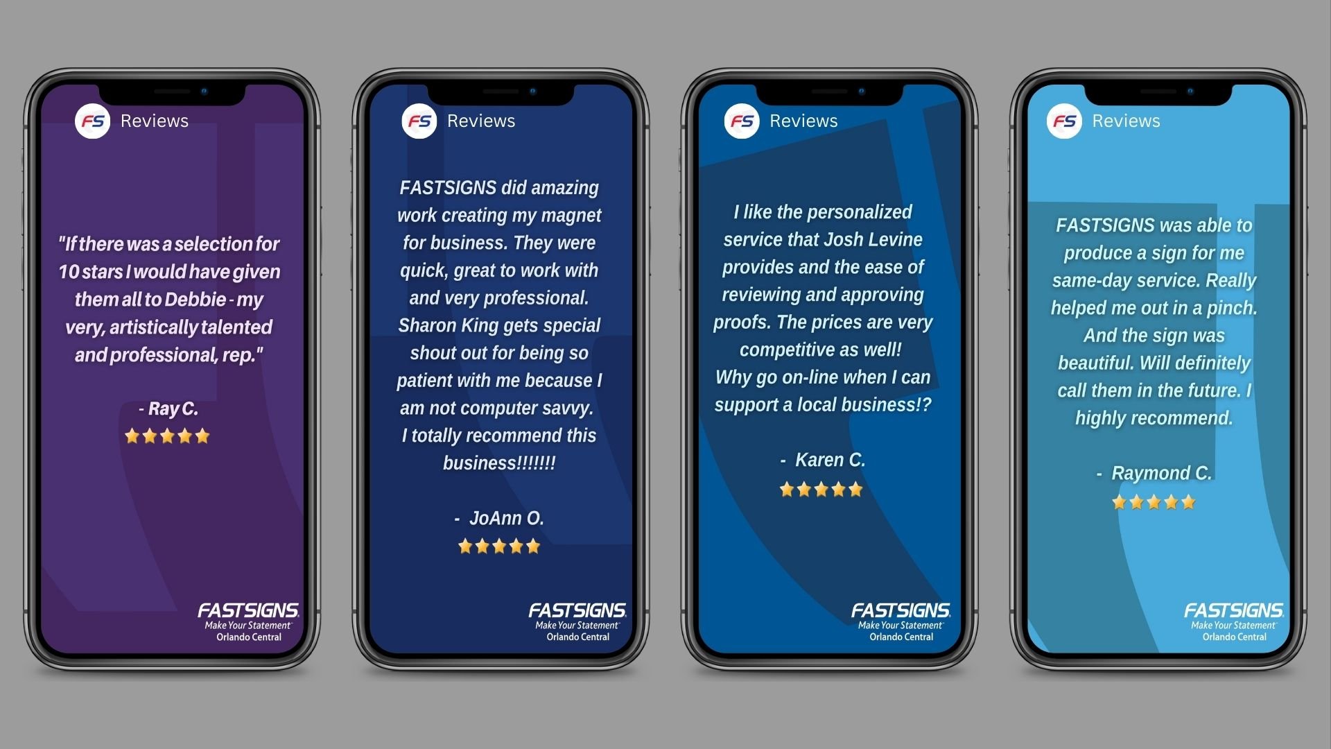
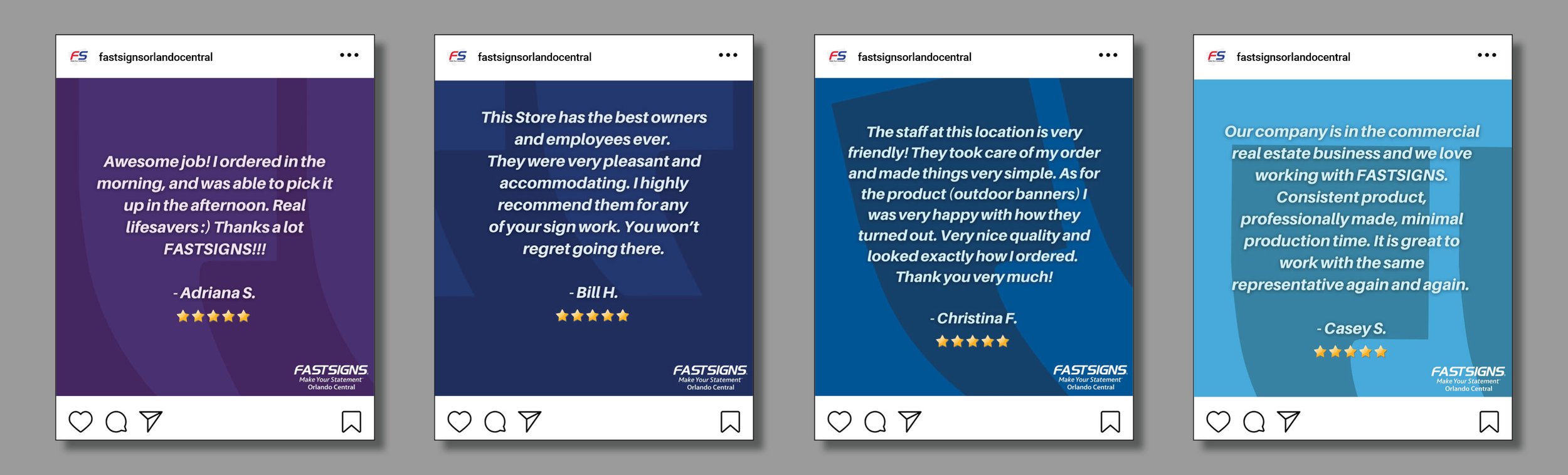
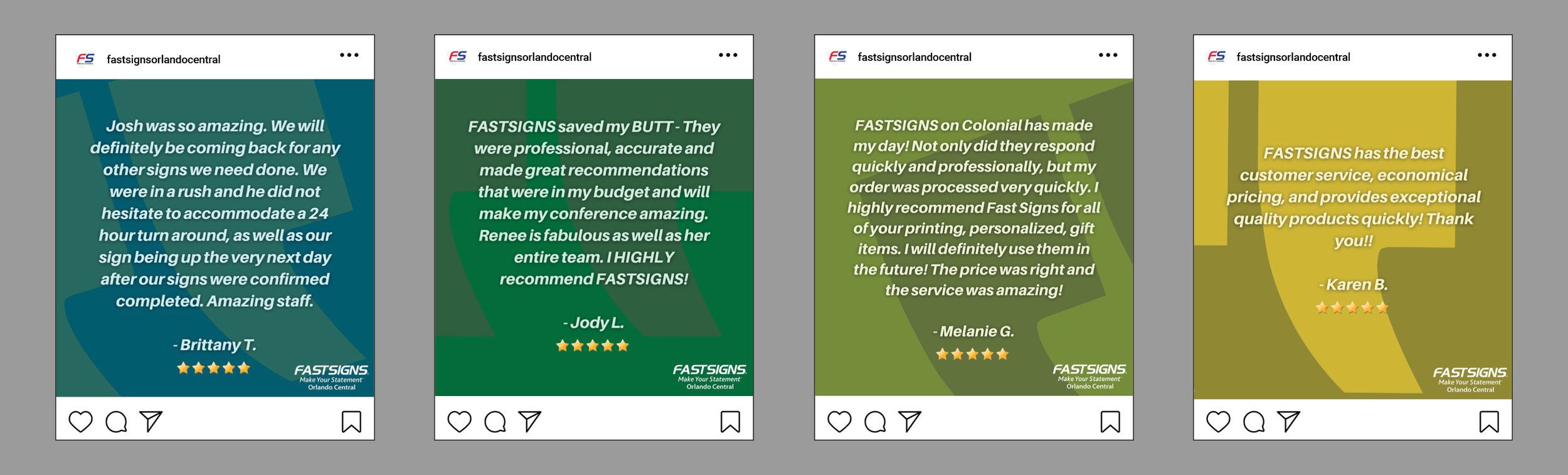
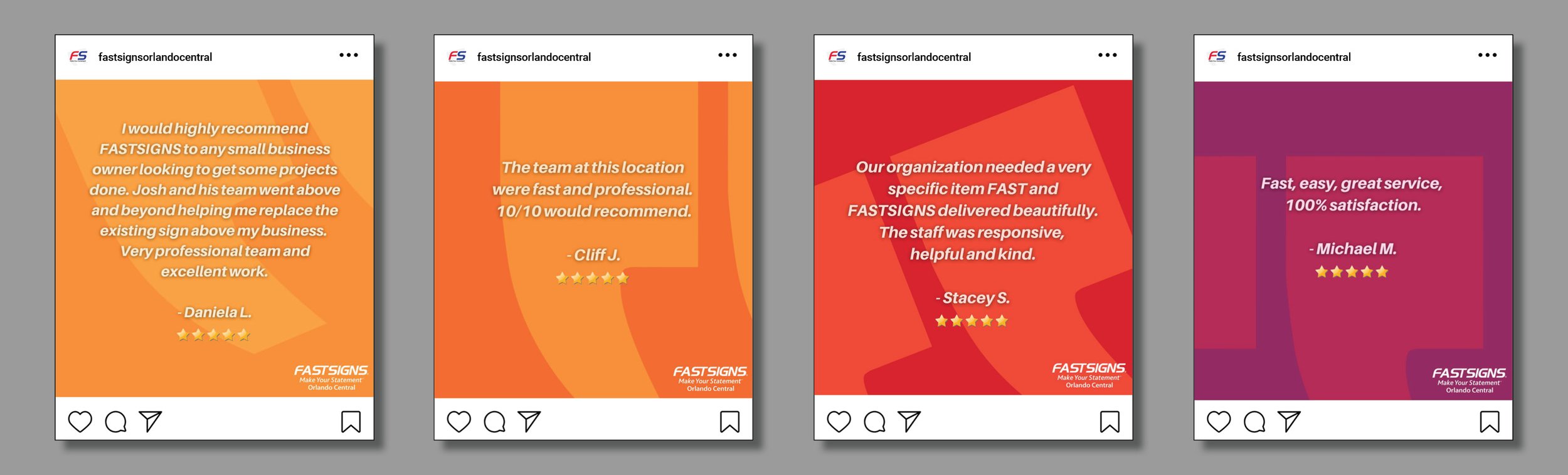
FASTSIGNS Orlando Central
FASTSIGNS Orlando Central is a leader in the design and manufacturing of custom signs, banners, graphics, vehicle graphics, and signs for windows, walls, and doors. As the Marketing Assistant, I created a variety of content, which included creating images, graphics, and logos for FASTSIGNS social media accounts, in-store marketing, and printed marketing mailings.
Social Media & Marketing
I streamlined their social media accounts for a cohesive look within their company brand guidelines. Their iconic quotation marks and bold estblished color schemes were preserved in the exploration of new designs. Through videos, photographs, and entertaining captions, I created content that educated customers about our products.


Video Reels


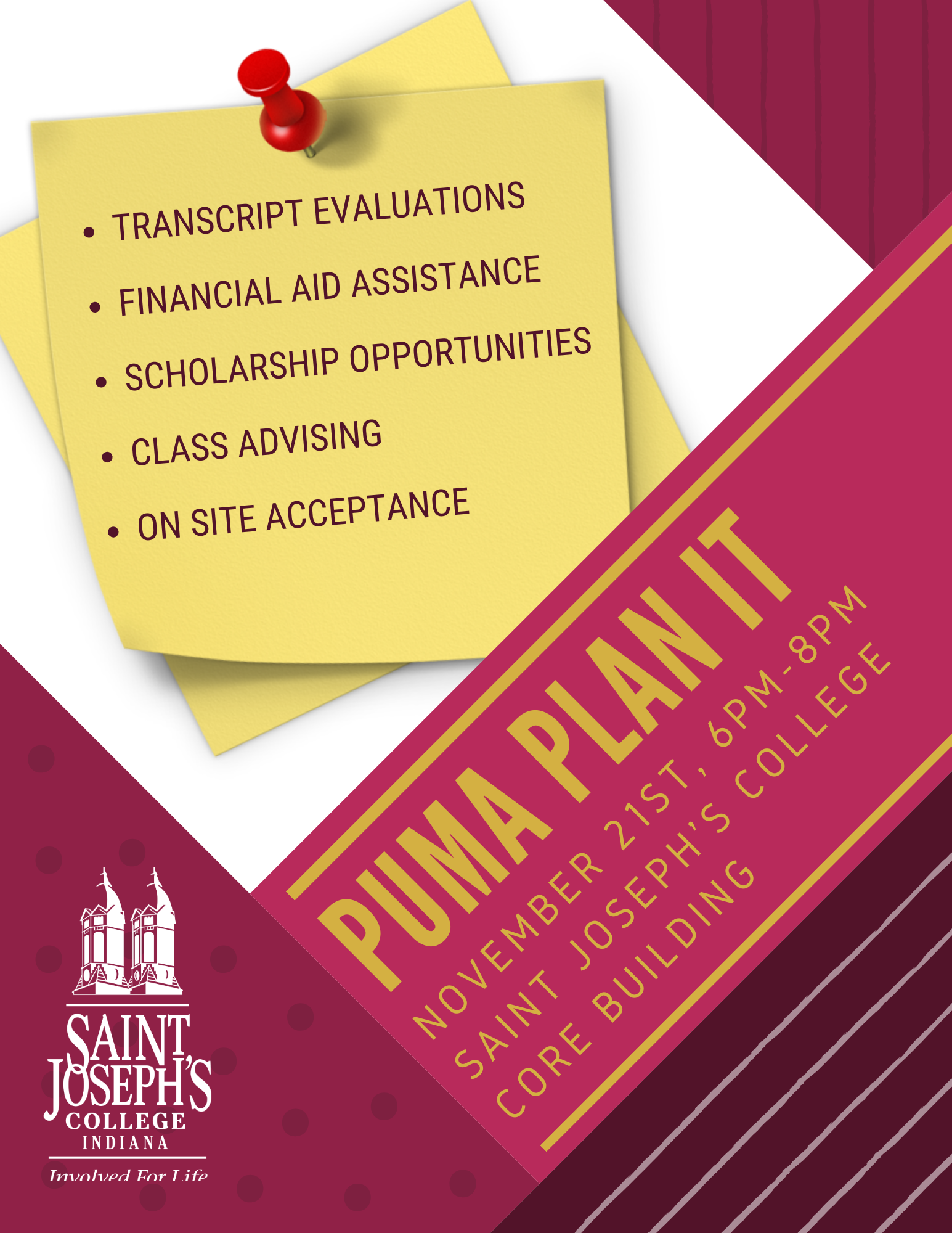
Saint Joseph’s College - Marketing Communications
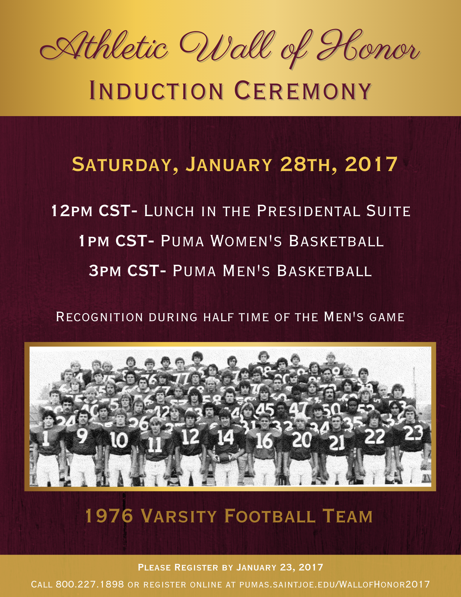
While in college, I was the Marketing Communications Intern at Saint Joseph's College in Indiana. I worked on projects under the supervision and direction of the Marketing Director in their Institutional Advancement Office, exploring the process of staying true to their branding guidelines while experimenting with creative ideas within it. As a department, we worked as a team to create and develop our concepts to finalized marketing materials. Below are some of the projects, including flyers, images for social media content, calendar advertisement inserts, and Alumni mailings.
Marketing Materials & Flyers


Logos